<Tetley Tea>
Project Online Work and Capacity Graphs in Power BI – solution starter
A lot of my work now revolves around producing Power BI reports using the Project Online oData feed (you can find my reporting pack for Project Online here) , and of course one of the main goals is to produce great looking work and capacity graphs, so let’s have a look at how to do that.
Connect to your PJO oData feed
I’m going to assume that you know how to connect Power BI into Project Online, but if not, don’t worry, there is documentation available here and also you can download the solution starter outlined in this blog here.
Creating a Work and Capacity Graph – version 1
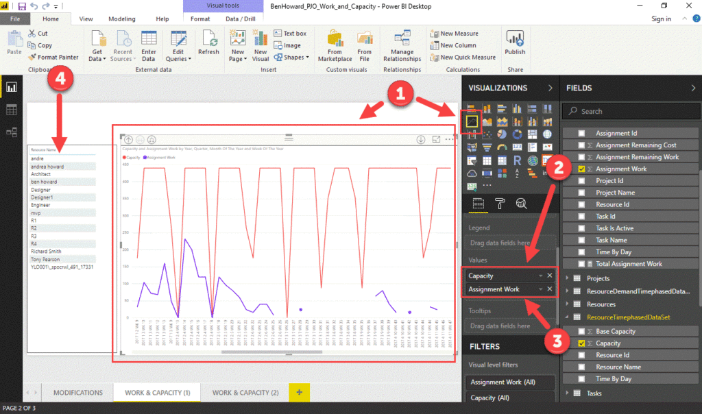
So, once connected to our oData feed it’s a really easy job to create the graph.
- Insert the line chart visualisation onto the canvas
- Insert the AssignmentTimephasedDataSet[Assignment Work] column into the values area for the chart. Ensure you are viewing the sum of the Assignment Work.
- Insert the ResourceTimephasedDataSet[Capacity] column into the values area for the chart. Ensure you are viewing the sum of the Capacity
- Insert the Resources[Resource Name] column into a Table or Filter visualisation.
You should end up with a report that looks similar to the one below.

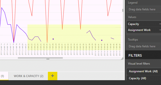
The issue that this chart shows, quite clearly, is that we don’t necessarily have contiguous Assignment Work values, and so where there isn’t an Assignment Work value for a particular date the Power BI graph displays nothing! This makes the graph difficult to read as can be seen below.

So what’s the issue? Well basically where only a single data point exists, Power BI just draws a dot, and where two or more exist, it draws a line between them; if no data exists Power BI doesn’t draw anything and the graph becomes difficult to read.
Create a DAX measure to calculate the correct values
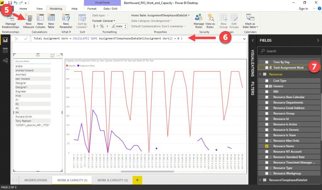
What we have to do is find a way to trick Power BI so that it displays a zero even when there isn’t an Assignment Work value for a date. The way to do this is to use a calculated measure, which sums all of the Assignment Work and then adds 0 to the result as per the DAX calculation below.
CALCULATE( SUM( AssignmentTimephasedDataSet[AssignmentWork]) + 0 )
To create the measure follow the instructions and refer to the image below.
5. Click on the New Measure icon on the Modelling tab
6. Enter the measure name and the calculation into the formula bar
7. Check the measure appears in the field well. You can also set the home table for the measure (in large files it is often best to keep all the measures together in a separate table).

Creating a Work and Capacity Graph – version 2
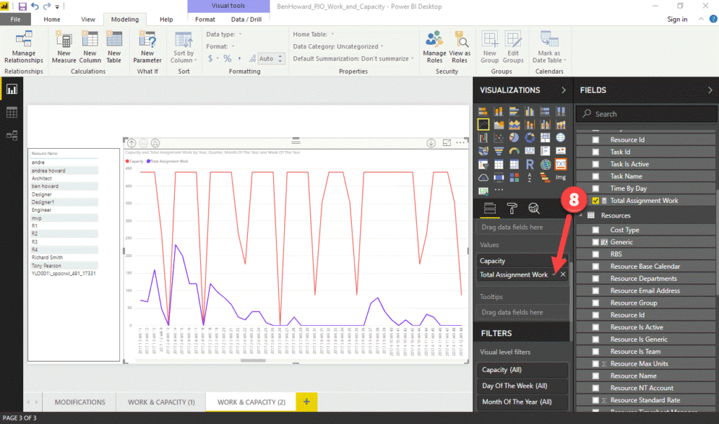
The next stage is really simple, it’s just a question of replacing the existing Assignment Work value with the new measure.
8. Add the Total Assignment Work measure into the values section of the visualisation, replacing the existing value.
The difference is immediate, resulting in a readable graph!

The solution download is available here, and an accompanying video here.
Enjoy, Ben.