29 Sep Gantt Charts in Power BI
Over the last year or so Power BI has made a real charge to become THE reporting tool for many applications, including of course Project Online. There are lots of great things about Power BI (and some not so great too!), including the very quick release cycle (dare I use the word agile!). Whereas Excel and the traditional office tools have a release cycle of every 2-3 years, an update to Power BI is released every month or so, bringing with it new capabilities, and also, new visualisations.
One of the cool new visualisations I’ve been using is the Gantt Chart one, and so I figured it was worthy of a blog.
Getting Started with Power BI and Project Online
If you’re new to Power BI with Project Online, you might want to start at the following sites.
http://applepark.co.uk/powerbi-on-the-technet-uk-blog/
Using the Gantt Chart Visualisation
Assuming you’re familiar with Power BI and accessing Project Online data using oData, then let’s get started with the Gantt Chart. This is a new visualisation that pretty much does exactly what is says on the tin!
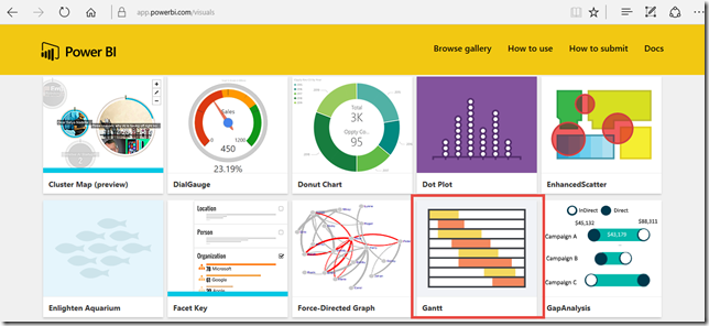
In the 1st instance, navigate to the Power BI Custom Visuals gallery at https://app.powerbi.com/visuals/ and download the Gantt visualisation. I must admit the icon is pretty underwhelming!
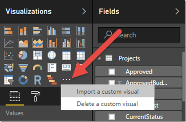
Then open up Power Bi Desktop, and once connected to your Project Online oData feed, add in the visualisation by clicking on the elipses with the Visualizations column and choosing Import a custom visual.
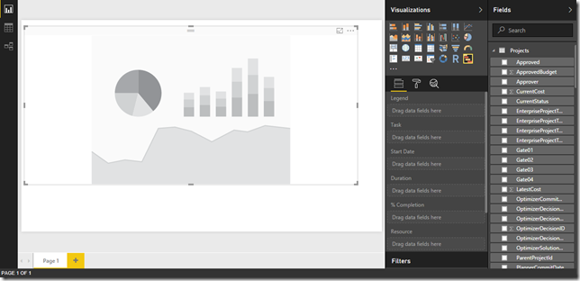
Once it’s been imported (and you’ve checked to verify you trust the visualisation), then drag the visualisation to the canvas.
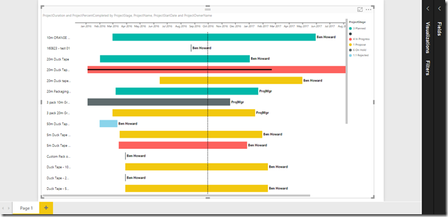
Now it’s just a question of populating it, and the table below gives a default scenario for Project Online data
| Field name | Typical Project field | Comment |
| Legend (optional) | ProjectOwnerName or Custom ECF such as sponsor | The legend is a the way to colour projects which have similar attributes, such as the owner or sponsor. |
| Task | ProjectName | Typically we’re using Project level data, but in truth we could display a Gantt chart for task level data. |
| Start Date | ProjectStart | |
| Duration | ProjectDuration | |
| % Completion | ProjectPercentCompleted | Displays a bar from the project start date through to the %complete value. By default this is a thin black line, but the line colour can be changed by selecting a different colour within Format | Task completion | Completion Colour. |
| Resource (optional) | ProjectOwnerName | The Resource field is displayed to the right of the Gantt chart, and typically displays the name of the resource assigned to the task. For our Project level gantt chart, I’ll either leave it blank or use the owner field (as in this case) or some other relevant field per project (eg Sponsor, department, customer name etc) |
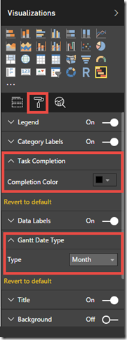
Once we’ve completed the fields, then there are a couple of additional fields to be aware of, and these exist in the Format section.
1. Task Completion colour – it is possible to change the colour of the line that represents the % complete.
2. Gantt Date Type – choose from Days, Weeks, Months and Years to change the timescale.
The other Tools are the usual ones.
Once we’ve put this together, we get a great looking chart…
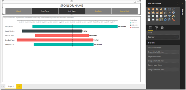
With a typical Project Online system, there will already be too many projects to display in on page, necessitating lots of scrolling. So it’s worth having a page filter to get rid of projects that are marked as completed or on-hold, and also worth adding in a filter. In the screen shot below I’ve used an ECF called Sponsor which nicely reduces the data for me.
So, that shows you the power of Power BI with custom visuals. I’ll be reviewing the other custom visuals to see which are useful for Project Online.
Enjoy, Ben.


