A customer posed the challenge earlier this week of producing a work and capacity report using the Reports feature in MS Project.
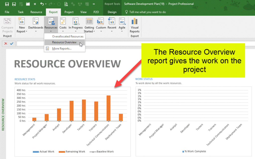
Using the existing Resource Overview Report
I was happy with getting the total work per resource from the project, as this is already available as a graph on the Resource Overview report. You can see this graph highlighted in the image below.
Calculating the Resource Capacity
The more interesting part of the puzzle was to add in the resource capacity for the project. We could do this manually, by working out the number of working days in the project and multiplying that by the number of hours a resource works per day, but this is a tedious task and we would need to recalculate this each time the project duration changed. A better way to calculate the capacity is to automate it by using a resource custom field with the following formula
ProjDateDiff([Project Start],[Project Finish]) / 60 * [Max Units]
If we break this formula down it works the following way…
- ProjDateDiff([Project Start],[Project Finish]) – provides the number of working minutes between the project finish date and the project start date
- / 60 – converts the number of minutes into hours
- * [Max Units] – multiplies the number of working hours in the project by the resource’s max capacity, giving the capacity for the period of the project, so if the [Max Capacity] is 50%, the total capacity for the resource for the project is 50% of the total project working time.
In my case I’ve created the formula in the Resource Number 1 Custom Field.
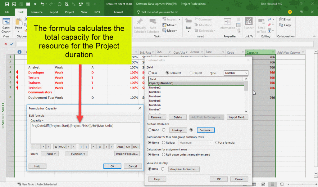
As can be seen in the image, the capacity for the resource is 766 hours (each of these resources is set with Max Units at 100%] and the project duration is 95.75 days (95.75 * 8 hours = 766 hours).
Adding the Resource Capacity to the Resource Overview Graph
The final stage of the solution is to add the capacity value into the Resource Overview report. It’s a simple operation to add the field, though it can be slightly difficult to find in the field list. By clicking on the chart the field list is displayed on the right hand side of the report, and it selecting it will place it in the chart. In the image below I’ve removed the baseline and actual work fields, leaving the total work and capacity for each resource in the project.
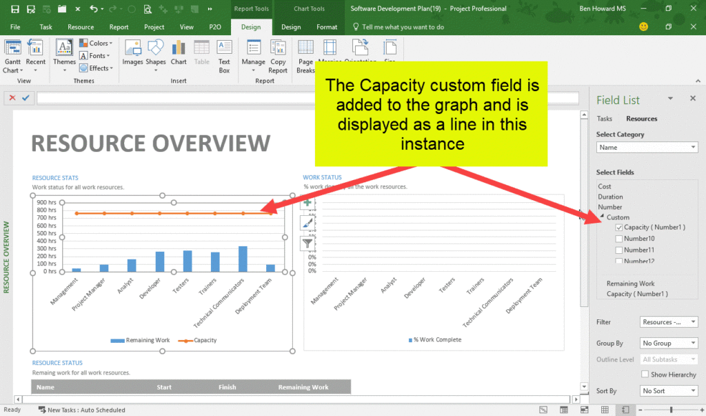
So, it’s that simple really, and this is a good starting point for viewing the total work vs the total capacity by resource and certainly met my customer’s requirements.
Click here to see the video supporting this blog…
Enjoy, Ben.